For the 50th anniversary of The Reading Association of the Philippines (RAP), it partnered with BBDO Guerrero to encourage the appreciation for classic stories through a collection of original typefaces called “Font Books”. The concept was first introduced and created by BBDO Creative Director Michelle Edu who submitted the idea to the adobo magazine LIA Young Creative Competition in July 2019.
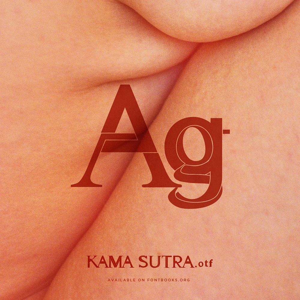
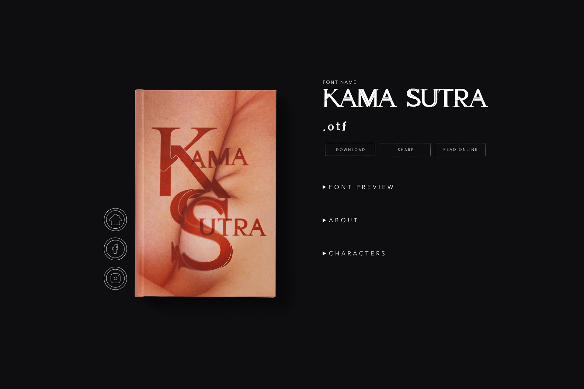
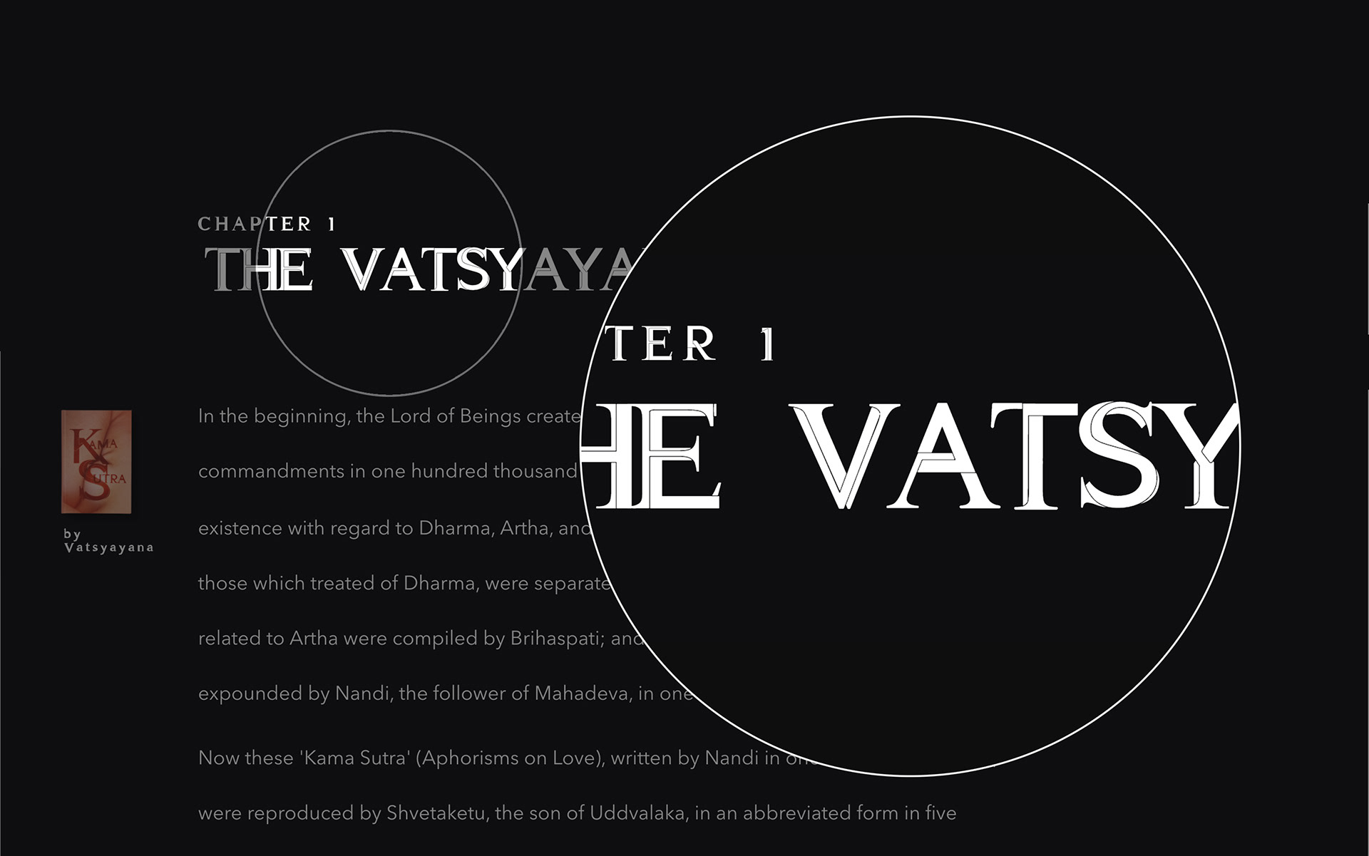
I was tasked to design one of the fonts from a list of classic titles, and immediately chose Kamasutra. I gave myself the challenge to avoid falling under the category of those typical sex-themed typeface cliches that to me come off as campy and lewd. It's quite easy to think of some examples: human figures in intertwined sex positions, human appendages, suspicious secretions, phallic or yonic symbolism - all this imagery manipulated to form letters. For me this route was expected.
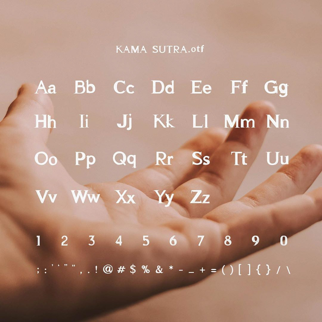
Rather, I wanted to come up with a simple design that depicts two different classic types of fonts: the sans-serif and the serif, merging in an erotic fashion. This idea came to mind when I realized that like human bodies, fonts too have corresponding parts, such as arms, ears, spines, and shoulders. I wanted to show sex positions in a font without being too literal. I also wanted to create something that can work both as a display typeface and a text typeface. I didn't want to do an overly designed piece since legibility would be an issue if it will be used to display excerpts of the literature.
Download the font here.
Watch the case video here: